We specialize in printing labels in high quality – not only in regards to our overall services but mainly in the artistic print techniques used. That comes with accurate colours management as well. Working for decades with the most demanding customers and partners in the region allowed us to handle all kinds of techniques on huge variety of base materials. You can trust us, when we say that each combination has its unique challenges to it.
Different base material can change the shade of a whole tin of print colour
Paper can be tricky. The structure, especially with “uncoated“ types of papers make the absorption variations rich. Then there are all varieties of “cream”, “pearl” or “extra white” papers and base materials you can choose from, which bring a new variation to the colour you want to see on your label. Did you know that all colours of labels are printed on white base materials, apart from very rare use of black base paper? Working with that is always an exciting job for us.
Another consideration is which print technology is used for the job (UV offset, UV flex, digital print etc.).
This means the colour we use needs to be a different mix with every one of the variations our clients choose. Imagine we would be buying litres of colour in a wrong shade for your order. That would be a waste of time and money. We have this managed to be able to give you fair price without such shameful surprises.
Colour approval process is essential
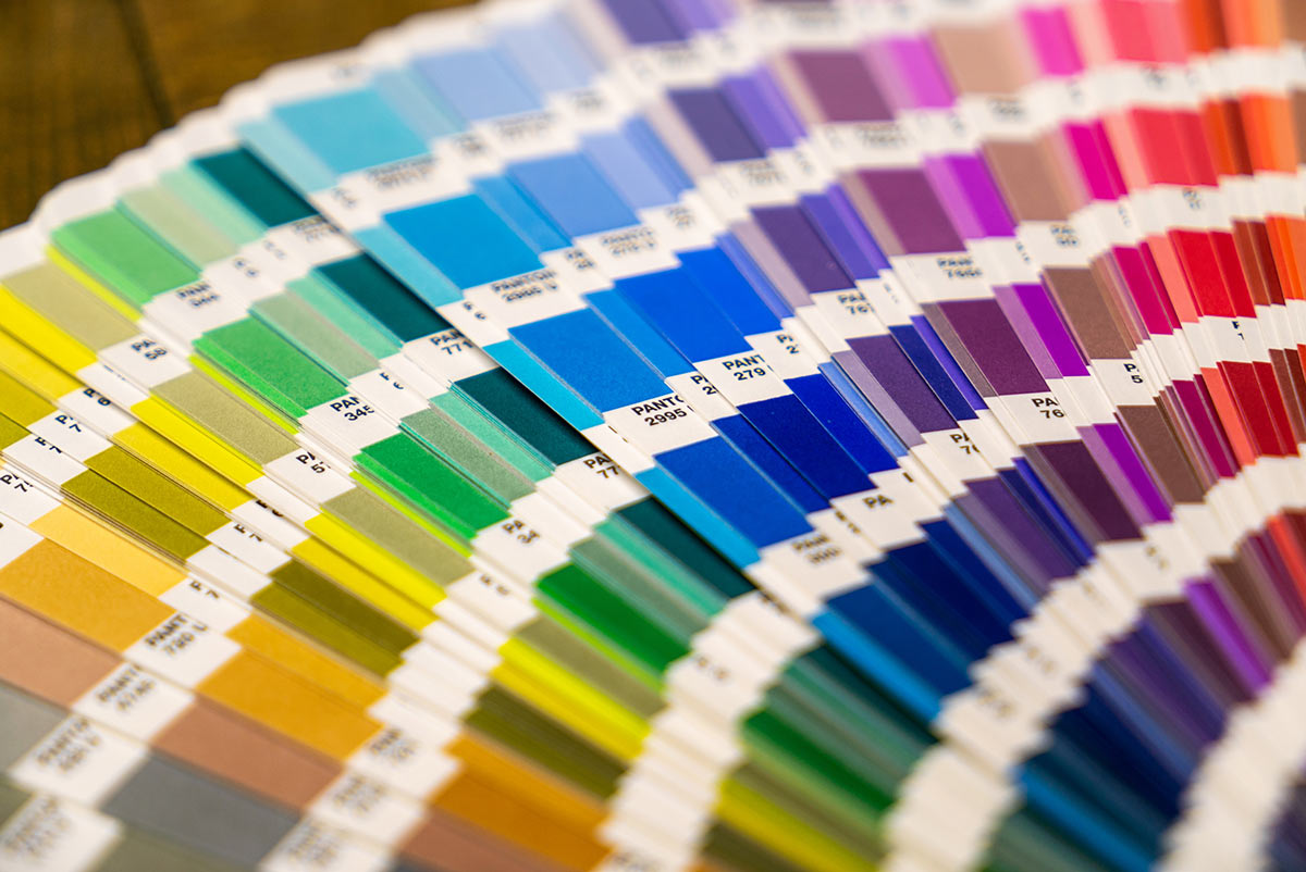
To match the right colour, we first of all need to be sure of your choice. That is why we mention the agreed Pantone shade in the order validation process. Please do not confirm it from a look at a computer screen, or any digital screen, nor from a standard print out from some office machine.
To be sure you are ordering the colour you really wished for, first option is to check a Pantone sample with our colleagues. Then there are options of external reference print services we can mediate. In addition, we can provide you with a 95% matching colour reference print out internally much quicker and for a lower price. This is thanks to our new digital print machine. Our latest technical addition prints not only with standard CMYK colours, but uses two extra colours (orange and green), that make it a very reliable comparison tool to Pantone samples.
To sum it up, we offer you colour management on highest level. It is thanks to years of our experience and the cooperation with most demanding partners, as well as thanks to investments in our capacity. Enjoy the added value in working with us and get the right colours without unnecessary complications.


