What else can you change while changing the look of your labels?
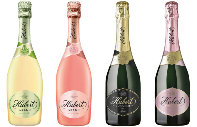
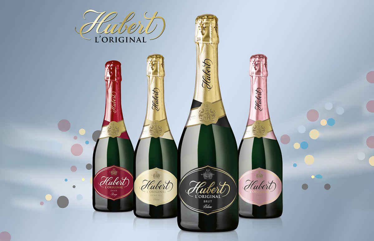
Hubert J.E. was founded in 1825 as the first company in Europe outside of France where the production of sparkling wine on the basis of original French recipe began. Since then, they have taken pride in their sparkling wines and have wanted them to reflect elegance, luxury, and the best quality. Keeping pace with that motto, company choose to update as well the visual of the Slovak sparkling wines.
From the previous combination of designs and forms of labels (self-adhesive, but also “wet-glue” applied by the wet process, printed in a different form), Hubert J.E. switched to new designs in a more attractive design of exclusively self-adhesive labels. This is a logical business decision. On the one hand, they manage to reach new clients with an interesting change in the appearance of their products. At the same time, the optimization of the portfolio technology will simplify the labelling process and related internal processes.
How can Purgina help during such change process?
Our solutions have helped to optimize the combinations of base materials for each product line. In the beginning, there was an assignment for materials from a design studio. It is best to consult with our technologists right at that point. The variety of materials offered is huge. Choosing the right one in consultation with our technologists right at the beginning, Hubert made sure that both the final printing and the material costs and, last but not least, the behaviour of the material in the specific conditions necessary for their product were ideal.
The printing technology of individual design variations itself was also developed in close cooperation between the client’s marketing department, and our technologists. They compared the design ideas with possible technologies of print during design process. Thanks to this joined effort, Hubert could choose unique solutions. For example, in the Hubert DeLuxe and Hubert Club lines the bottle neck labels have a specific pearlescent effect using screen printing. While the main labels have a background texture using debossing printing. The client’s team was able to approve these refinements and their colour effectively before ordering the print. All thanks to the 1:1 samples provided by us directly in our printing house.
Digital print samples directly from us also provided Hubert with an effective solution for selecting the final colour and material combinations for the premium Hubert L’Original and Hubert Grand series. These could be chosen according to samples from our digital machine, which can reliably simulate up to 95% of Pantone shades. Directly in Purgina they were able to choose from several material options combined with a large number of colour shades. This helped to make a responsible decision for the right colour and base material combination so that all products match together.
We also optimized the technical requirements for labels after they were tested in practice by the client. This means that even after the most demanding processes of filling and labelling bottles with new label designs, we consulted and in case of complications found more suitable solutions for combinations of materials (material, glue, carrier), or the printing finishing. Of course, we provide as well support in waste management, where we also handle the certified disposal of residual material according to current legislation.
The success of such a complex change is possible only thanks to intensive cooperation with the client, and also internally within our Purgina team. Ideally, just like here, when we can join with our expertise right at the beginning of the works on a new design. Without trust from our clients, the results would not be as pleasing as in this case. Thank you for that!


